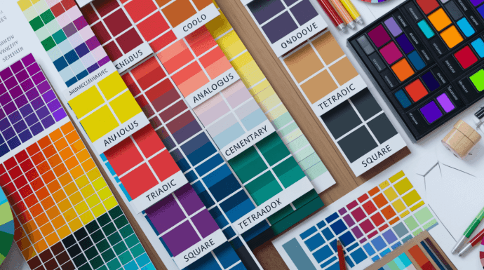
Have you ever created a color palette that felt absolute perfection on your screen—vibrant, modern, and punchy—only to run it through an accessibility checker and watch it fail completely? Or worse, have you ever passed a standard contrast test with a ratio, but when you stepped back from your monitor, the text still felt weirdly strainsome to read?
If you’ve spent any time designing web interfaces, posters, or digital marketing assets, you’ve likely felt that exact frustration. We want our work to be bold, creative, and visually engaging, but we also want it to be inclusive and readable for everyone, including the millions of people living with low vision or color vision deficiencies.
For years, design workflows treated accessibility auditing like an afterthought—a tedious mechanical chore at the very end of a project. But a major shift is happening under the hood of modern design engines. By moving away from legacy mathematical color spaces like sRGB and HSL toward perceptually uniform color models (like OKLab and OKLCH), and pairing them with automated accessibility auditing, we can finally build visual work that is both breathtaking and effortlessly accessible.
Let’s break down how human color vision actually works, why our traditional color math has been tricking us, and how you can apply these modern tools to elevate your everyday design workflow.
1. The Glitch in the Matrix: Why HSL and sRGB Lie to Our Eyes
To understand why color accessibility often feels clunky, we have to look back at how computers originally learned to represent color.
Most digital design software historically relied on sRGB or HSL (Hue, Saturation, Lightness). HSL was invented in the 1970s as a friendly, human-understandable way to pick colors on a computer screen. In HSL, color is modeled as a cylinder: pick a hue angle ( to
), dial up the saturation, and set the lightness from
(black) to
(white).
It sounds clean and logical, but it hides a massive flaw: human vision is not linear.
Our eyes do not perceive all wavelengths of light with equal intensity. Human retinas are extremely sensitive to green and yellow light, but much less sensitive to blue light.
Consider this simple test in HSL:
- Pure yellow (hsl(60, 100%, 50%)) has a lightness setting of
.
- Pure blue (hsl(240, 100%, 50%)) also has a lightness setting of
.
Mathematically, HSL claims both colors possess identical “lightness.” But visually, yellow feels blindingly bright, while blue feels deep and dark.
HSL vs. PERCEPTUAL REALITY
HSL Model (Mathematical):
[ Yellow: 50% Lightness ] <===================> [ Blue: 50% Lightness ]
Equal Values!
Human Perception (Reality):
[ Yellow: Perceived Bright ] >>> HUGE GAP >>> [ Blue: Perceived Dark ]
When traditional Web Content Accessibility Guidelines (WCAG 2.1) calculate contrast ratios, they rely on relative luminance values derived from sRGB mathematics. Because this math doesn’t fully account for human visual perception, it creates strange edge cases:
- False Positives: Color pairings that pass the
mathematical threshold but remain genuinely hard for human eyes to parse.
- False Negatives: Beautiful, perfectly readable low-contrast combinations (like dark mode pastels) that get flagged as accessibility violations.
2. Enter Perceptual Color Spaces: OKLab and OKLCH
To fix the mismatch between computer math and human biology, color scientists developed perceptually uniform color spaces.
In a perceptually uniform color space, a numerical change of in lightness or saturation corresponds to a
change in how bright or saturated the color actually looks to a human eye, regardless of the hue.
While older spaces like CIELAB paved the way, the modern star of web and graphics engineering is OKLCH (pioneered by Björn Ottosson in 2020). OKLCH defines color using three intuitive perceptual parameters:
(Perceptual Lightness): Ranges from
to
. Unlike HSL, a lightness of
in yellow feels identical in perceived brightness to a lightness of
in blue.
(Chroma): Measures the purity or intensity of the color (similar to saturation, but perceptually scaled).
(Hue): The color family expressed as an angle on the color wheel (
to
).
Why OKLCH Changes Everything for Palette Design
Because lightness in OKLCH is perceptually uniform, generating accessible color palettes becomes predictable and programmatic:
- Predictable Dark Modes: If you swap a light theme background for a dark theme background by simply inverting the
value, the visual contrast against your brand colors remains balanced.
- Smooth Color Gradients: Traditional sRGB gradients often suffer from a muddy “gray dead zone” in the middle of a transition (e.g., blending blue to yellow). Perceptual spaces calculate the shortest distance across natural human vision, resulting in rich, radiant gradients.
3. The Power of Automated Accessibility Auditing in Modern Workflows
Knowing the science behind perceptual color is fantastic, but let’s be realistic: designers shouldn’t have to calculate non-linear chromaticity equations every time they choose a background shade for a graphic or poster.
This is where automated accessibility auditing steps in. Modern design software is integrating perceptual contrast algorithms—such as the upcoming WCAG 3.0 APCA (Advanced Perceptual Contrast Algorithm)—directly into real-time rendering engines.
Instead of waiting until a poster or website layout is complete to run a manual contrast check, modern automated systems evaluate color relationships dynamically as you work.
MODERN PERCEPTUAL DESIGN WORKFLOW
[ Creative Concept & Color Ideas ]
│
▼
[ Real-Time Generative Layout & Color Engine ]
│
▼
[ Automated Perceptual Audit (APCA / OKLCH) ] —> Dynamic Contrast Warnings
│
▼
[ Instant Palette Adjustment & Optimization ]
│
▼
[ High-Impact, Accessible Visual Asset Output ]
Seamless Execution in Generative Tools
This automation shines brightest when paired with modern, fast-paced creation tools. For instance, if you are prototyping visual compositions or marketing assets using an AI poster tool from Adobe Express, you can rapidly experiment with diverse color schemes and typographic hierarchies without constantly stopping to recalculate contrast ratios.
Because modern design suites incorporate intelligent color engines and automated accessibility frameworks behind the scenes, you can generate eye-catching, high-contrast layouts in seconds. The automated auditing takes care of guardrails like font size vs. contrast weight, freeing you to focus purely on storytelling, mood, and visual impact.
4. Practical Tips for Accessible, Perceptually Balanced Design
Whether you’re building a massive brand design system or designing a quick promotional flyer, here are four practical techniques to ensure your work looks amazing and stays accessible:
Tip 1: Design in Gray First (Focus on Luminance)
Before picking your visual hues, view your design in grayscale. If your layout relies purely on hue differences (e.g., red text on a green background) rather than lightness differences, it will be unreadable for users with color vision deficiencies (protanopia or deuteranopia). Ensure your key text and focal points stand out clearly in pure black-and-white.
Tip 2: Scale Matters—Contrast is Relative to Weight
A contrast ratio that works perfectly for a giant bold headline might fail horribly for an
light-body caption. The APCA contrast model accounts for spatial frequency (how large or thin a shape is). Always bump up your color contrast as your font size decreases.
Tip 3: Embrace Perceptual Palette Generators
When building design systems, use modern palette generators that output in OKLCH or CIELAB (such as Chroma.js or native browser color pickers in modern CSS). This guarantees that every step in your color ramp maintains uniform contrast steps.
Tip 4: Leverage Automated Guardrails Early
Don’t treat accessibility as a final checklist item before export. Use plugins, automated linters, and smart generative environments right from the ideation phase. Letting software automate contrast checks while you generate assets saves hours of tedious rework later.
Conclusion: Accessibility as a Creative Catalyst
For a long time, accessibility was viewed as a set of rigid boundaries that restricted creative freedom. But as our understanding of perceptual color math evolves and automated auditing tools become more sophisticated, the opposite is turning out to be true.
When you harness perceptual color models like OKLCH alongside real-time accessibility checking, you eliminate guesswork. You can push colors to their absolute visual limits, craft vibrant palettes, and explore dynamic layouts with complete confidence—knowing that your work will land with the exact same clarity and emotional resonance for every single viewer.
The next time you start a design project, don’t just pick hex codes at random. Think perceptually, let automated tools handle the math, and craft visuals that speak clearly to everyone!